WordPress Plugin
Welcome to Divi Mobi First
From one column to any column with the new Divi Mobi First Column Classes Plugin. Get full control over the number of columns displayed for the selected row in both the regular and specialty sections.
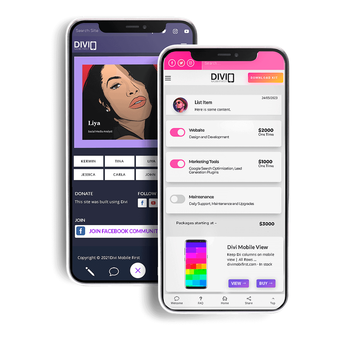
The Problem No One is Talking About
Divi has an amazing responsive preview system that allows you to see how your website will look on different devices and different screen sizes. However, what’s the one thing no one is talking about? We’ve addressed the elephant in the room and solved the problem.

The Big Elephant in the Room
Divi’s responsive editing options do not give any native control over the row layouts for mobile viewing. By default, each row converts to a one-column layout, unable to maintain or customize the columns and rows for the mobile viewport. This is a humongous limitation especially if you want to emulate an app-like theme for your website. And let us face it, if you are an experienced Divi user, you should be able to detect quite easily, sites that are built with the Divi theme. Yes, we appreciate Divi’s default media queries. It is the best thing ever. However, would you not prefer to have full control over these built-in media queries?

The One Column Phenomena
You are an awesome Divi child theme designer. You have built tons of great websites. Your desktop designs look great, but do you get the same reaction from the mobile user? Most Divi designers focus mainly on desktop conversions and ignore mobile impressions. It is not your fault. In fact, if there was a way to have full control over the default ONE column layout on the Divi builder, would you not take advantage of this? Most times we expect our desktop designs to somehow adapt to the mobile viewport, and once there is nothing overlapping, we consider it acceptable. But, this is a huge oversight, especially when appealing to the mobile user experience.

The Mobile Secret
The majority of today’s website visitors come from mobile devices. In a most recent study in 2023, from the FCC and NTIA, it was proven that over the last 11 years, mobile traffic has increased by 222%. This means that more and more users will be seeing the mobile UI version of your site and may never see the desktop version. Because of this, Google’s algorithm pays homage to sites that capture the attention of mobile users. Yes, Google loves mobile sites with attractive content. So, it is not merely enough that your site is responsive. It must also give an awesome mobile user experience.
Introducing
The Divi Mobi First Column Classes Plugin
for the Divi WordPress Plugin Page Builder. Take a closer look. Explore the mobile grid for both the regular and specialty section.
Scroll to Preview
Regular Section Layouts
Rows and Columns
Box 1
Box 2
Box 3
Box 4
Box 5
Box 6
Box 7
Box 8
Box 9
Box 10
Box 12
Box 13
Box 14
Box 15
Box 17
Box 18
Box 23
Box 25
Box 27
Box 29
Box 31
Box 30
Box 31
Box 32
Box 33
Box 35
Box 36
Box 38
Box 39
Box 41
Box 42
Box 44
Box 45
Box 47
Box 48
Box 50
Box 51
Box 54
Box 55
Specialty Section
Rows and Columns
Box 1
Box 2
Box 5
Box 9
Box 18
Embrace Mobile First Design
It’s time to shift the way you think about building websites; from Desktop First to Mobile First. That’s right! With just a few clicks you too can now build aesthetically beautiful mobile designs with our light-weight, intelligently crafted plugin for the Divi builder.
Create Beautiful App-Like Layouts
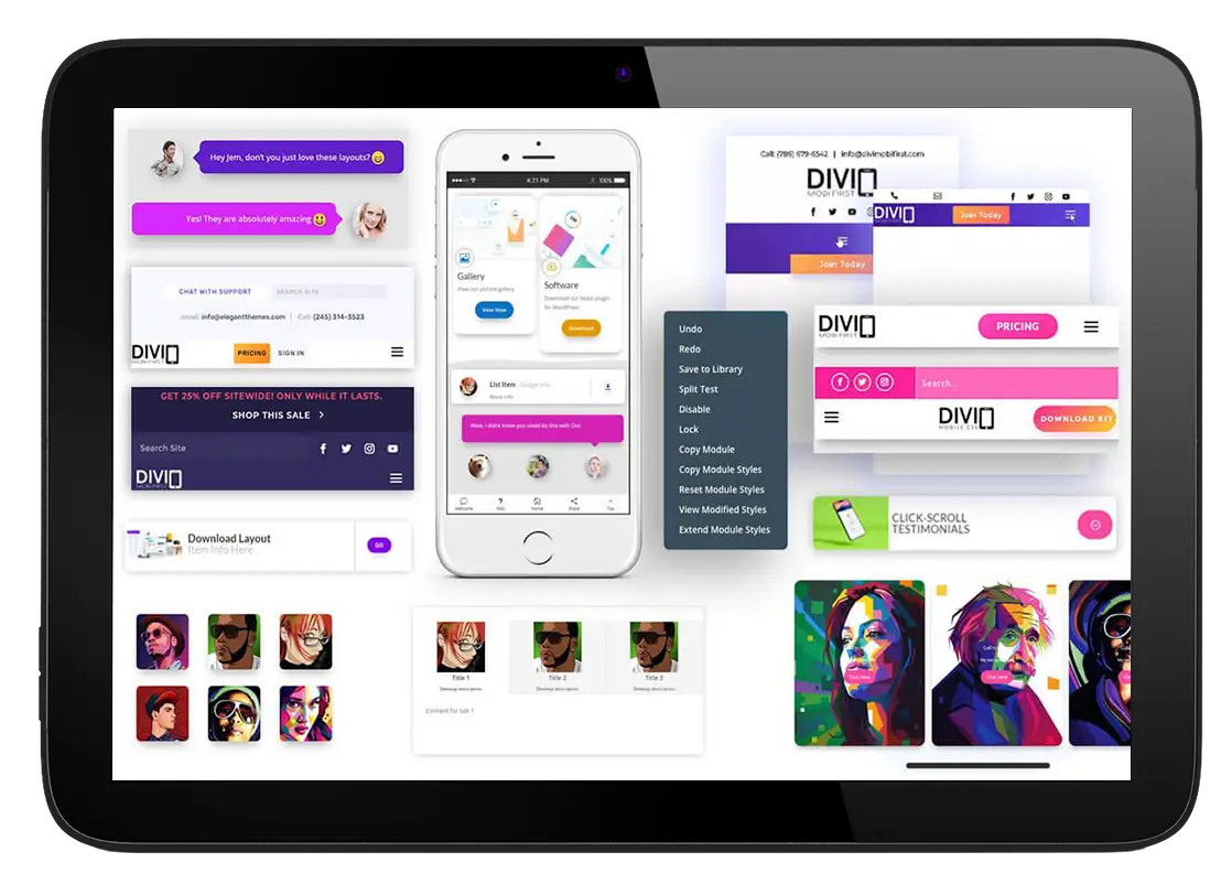
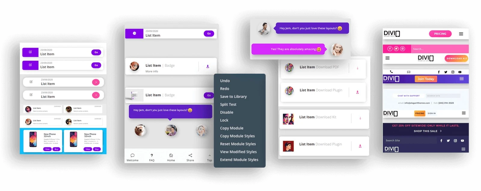
Build any design you want for both desktop and mobile devices. Create beautiful layouts that look absolutely stunning on both your smart device and desktop PC that make users wonder if your site was built with Divi.
Create Advanced Desktop Layouts Easier
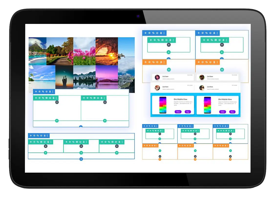
Fuel your imagination by embedding rows and sections side by side. Create gorgeous high converting mobile websites without having to install additional modules. Create your own layouts in minutes and transform your regular desktop sections into a highly optimized mobile masterpiece.
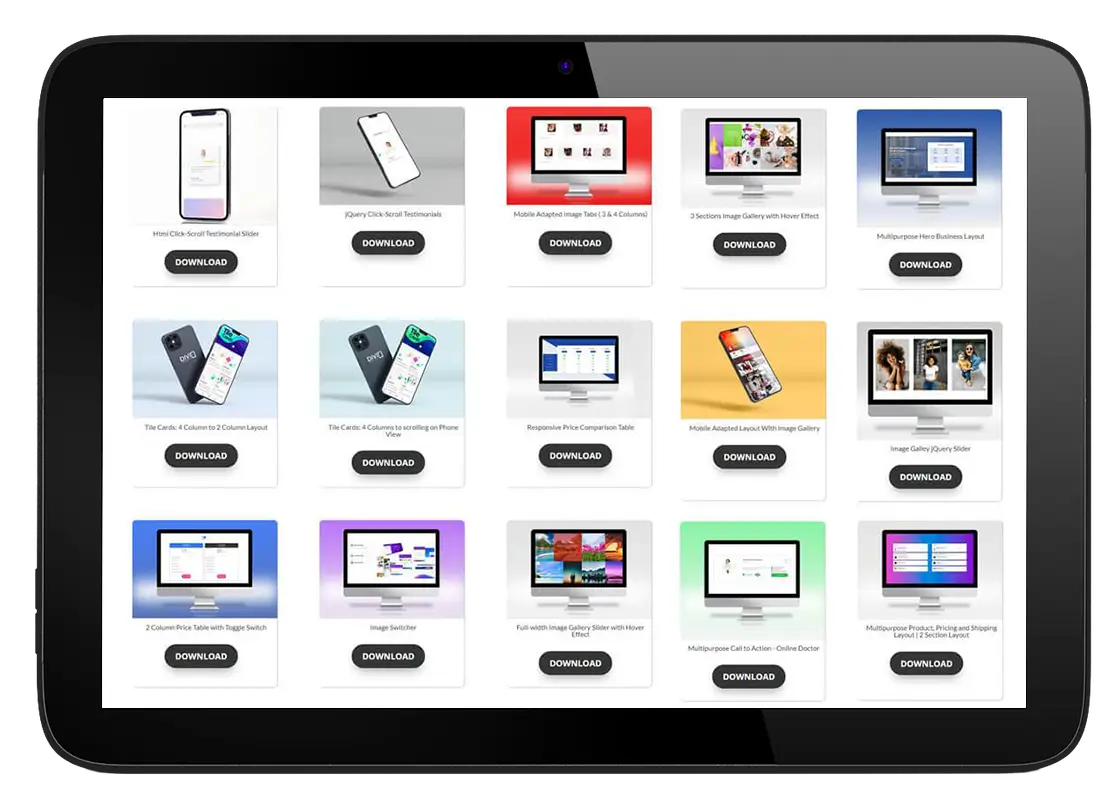
Download Free Templates
Purchase today, become a life-long member and get recurring ideas and layout downloads to reverse engineer and learn CSS and jQuery while you build.
Unlock the Power of Effortless Mobile Website Design
Imagine, at your fingertips, having the power to create gorgeous high converting mobile websites without having to install additional modules. Create your own layouts in minutes and transform your regular desktop sections into a highly optimized mobile masterpiece.
Enjoy Limitless Possibilities
Step up your Divi Front End game by moving away from the norm of finding a module for all your designs. Finally you can create any design you want for both the desktop and mobile device. Create beautiful layouts that look absolutely stunning on both your smart device and desktop PC that make users wonder if your site was built with Divi.
Within the first 10 seconds your potential customer is building up a lasting opinion about you based on your web design. Make sure you make the right first impression on every device.
Whose this For?
This bundle was created for you:
If you use the Divi theme to build websites
If you’re looking for innovative layout concepts that function well on mobile devices.
If you want additional control over your rows and sections to assist in correctly aligning your layouts for tablet and phone views.
A Smart Choice For:
AGENCIES
DIVI FREELANCERS
EXPERTS
WEBSITE OWNERS
TEAMS
DIVI DESIGNERS
Test Drive for 14 days
If you are part of the .01% that don’t see a notable benefit in your productivity and design goals with our Mobile First Divi Solution, simply reach out to us via message within 14 days for a full money-back. You still keep the bonuses.

So Here’s What You’ll Get
Column Classes Plugin
30+ Templates
JSON Uploads
Templates Club
Customer Support
Divi jQuery Course
Done for You Layouts
Keep Any Desktop Row on Mobile
Module Reordering
Sticky Popups
Image Switcher
Two Sections Side by Side
Clickable Parallax
Mobile Menus
Comparison Pricing Table
Two Rows Side by Side
Sticky Footers
Mobile Infinity Sliders
Scrolling Tile Cards
Changing The Blog Grid
Mobile Tabs
Price Tables
Fullwidth Gallery Slider
Available Translations

English

Italian

Indonesian

Serbian

Spanish

Portuguese

French

Bulgarian

German

Norwegian

Turkish

Polish

Swedish

Finnish

Slovak

Romanian
What Users Have to Say?
Some images may not reflect the actual person
View Pricing
Personal
Commercial
~ 100% SECURE Processing
Bonus Layouts
Optimize your Divi desktop designs for the mobile device without breaking a sweat.
See Menu For Live Demo Examples
If you can imagine it, you can create it.
No need for extra modules or ‘resource draining’ plugins.


