


Create a Divi Popup Modal in jQuery
Create a Divi Popup Modal in jQuery with our detailed tutorial. Learn to integrate dynamic popups into your Divi theme website, enhancing user interaction with simple jQuery and CSS code examples. Perfect for Divi Builder users looking to add interactive web features.
Popup Modal with Button Click
Introduction
Creating a Divi Popup Modal in jQuery can significantly enhance your website’s interactivity. In this step-by-step tutorial, we’ll show you how to integrate dynamic popups into your Divi theme website, making it more engaging for your visitors. By following our easy-to-use jQuery and CSS code examples, you can implement interactive web features that improve user experience.
Setting Up jQuery for Interactive Popups
To add a dynamic popup modal to your Divi website, you’ll first need to prepare your jQuery and CSS code. Here’s a step-by-step guide to get you started.
- Open your Divi Builder: Navigate to the page where you want the modal and open it in the Divi Builder.
- Add a Code Module: Insert a Fullwidth Code module to your page to embed the jQuery.
- Embed the jQuery: Place the following code inside two <script> tags in the module:

jQuery Code Setup:
- Start by adding a new Fullwidth Code module to your page.
- Insert the jQuery code below within two
<script>tags:
jQuery(document).ready(function($) {
  // Move all mobi-modal elements after the footer tag
  $('.mobi-modal').insertAfter('footer');

  // Add close button dynamically to each modal
  $('.mobi-modal').each(function() {
    let closeButton = $('×');
    $(this).prepend(closeButton);
  });

  // When the user clicks the toggle button, open the corresponding modal
  $('.mobi-modal-toggle').on('click', function() {
    let buttonId = $(this).attr('id');
    let modalId = buttonId.replace('mobi-modal-button', 'mobi-modal');
    $('#' + modalId).css('display', 'flex'); // Change display to flex to center content
  });

  // When the user clicks on  (x), close the modal
  $(document).on('click', '.mobi-close', function() {
    $(this).closest('.mobi-modal').css('display', 'none');
  });

  // When the user clicks anywhere outside of the modal, close it
  $(window).on('click', function(event) {
    $('.mobi-modal').each(function() {
      if ($(event.target).is(this)) {
        $(this).css('display', 'none');
      }
    });
  });
});
CSS Styling for the Modal:
Add another Fullwidth Code module for CSS and include the following between two <style> tags:
/* Modal container */
.mobi-modal {
  position: fixed; /* Stay in place */
  z-index: 1000; /* Sit on top */
  left: 0;
  top: 0;
  width: 100%; /* Full width */
  height: 100%; /* Full height */
  overflow: auto; /* Enable scroll if needed */
  background-color: rgba(0, 0, 0, 0.4); /* Black w/ opacity */
  display: flex;
  flex-direction: column;
  align-items: center; /* Center vertically */
  justify-content: center; /* Center horizontally */
  display: none; /* Hidden by default */
}
.mobi-modal > div {
  overflow-y: auto;
}
/* Close button */
.mobi-close {
  color: #000;
  float: right;
  font-size: 46px;
  font-weight: bold;
  position: absolute;
  top: 10px;
  right: 20px;
  background: #fff;
  outline: 2px solid #000;
  border-radius: 50px;
  padding: 5px;
}
.mobi-close:hover,
.mobi-close:focus {
  color: #aaa;
  outline: 2px solid #aaa;
  text-decoration: none;
  cursor: pointer;
}
Blurb Module

Step 2: Setting Up Modal Triggers and Containers to Create a Divi Popup Modal in jQuery
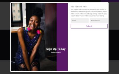
Add the following ID and Class to your trigger module, in this case a Blurb module as shown in the image above.
mobi-modal-button1

mobi-modal-toggle
Section Module

Setting Up Modal Triggers and Containers
Configure IDs and Classes:
Add the following ID and Class to the modal container. In this case the Section Advanced tab as shown in the image above.
/* Modal container */
mobi-modal1

mobi-modal
For Multiple Modals:
For additional modals, the numerical value for the IDs must coincide with each other.
In other words, if another modal was to be added, the ID for the container would be
mobi-modal2
and the ID for the trigger module would be
mobi-modal-button2
Best Practices for Using Popups
User Experience: Ensure popups are not intrusive. They should enhance the user experience, not hinder it.
Timing: Consider the timing of your popups. For example, display a popup after a user has spent a certain amount of time on your site.
Relevance: Make sure the content of your popups is relevant to your users. For instance, use popups to offer additional information, special promotions, or subscription invitations.
Conclusion
By following this detailed tutorial, you can create a Divi Popup Modal in jQuery that will add dynamic interactivity to your Divi theme website. Implementing these popups can significantly enhance user engagement and improve the overall user experience.


0 Comments