

Divi Mobi Column Classes Plugin: Transform Your Mobile Web Design in 5 Easy Steps
5 Easy Steps to Master the Divi Mobi Column Classes Plugin. Create Gorgeous, High Converting Mobile First Website Designs In Minutes… Using Our Extensive Divi CSS Library
Easily Master the Divi Mobi Column Classes Plugin.
Enhancing your mobile web design has never been easier, thanks to the revolutionary Divi Mobi Column Classes Plugin. This powerful tool is specifically crafted to elevate your Divi WordPress builder experience, enabling you to create stunning, high-converting mobile-first website designs in minutes. Let’s dive deeper into how you can leverage this plugin to transform your web design workflow and see your mobile layouts soar to new heights.
Creating Beautiful Mobile Layouts with Ease
The Divi Mobi Column Classes Plugin is your gateway to maintaining Divi column ratios while building aesthetically beautiful mobile layouts. By tapping into our expertly crafted CSS library, you gain access to over 30+ Divi mobile layouts. These layouts are not just about beauty; they are about effective communication and conversion optimization on mobile devices.
5 Easy Steps to Master the Divi Mobi Column Classes Plugin.
Regular Section Tutorial: A Step-by-Step Guide
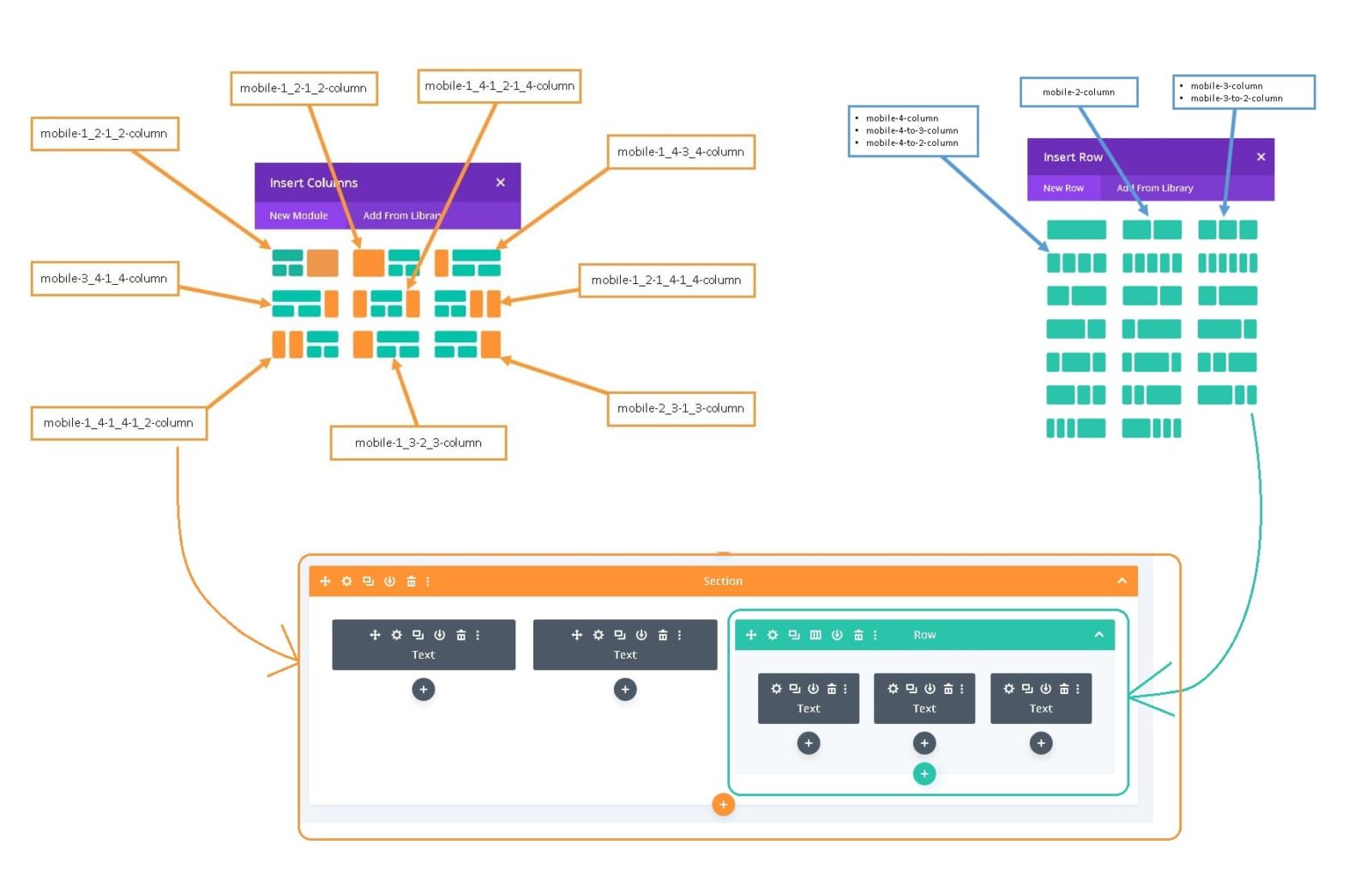
After activating the CSS plugin, the next thing you do is select the row that you want and type or copy the related CSS class name in the class field for the row container.
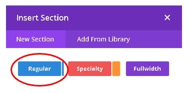
STEP 1.
Select the Regular Section: Begin by activating the CSS plugin. Navigate to the section of your choice and get ready to transform it with just a few clicks.
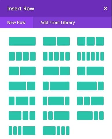
Step 2.
Choose Your Desired Row: Every design starts with a vision. Select the row that aligns with your creative direction.
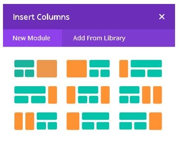
STEP 3.
Class Name Integration: Copy the class name corresponding to your selected row from our regular section chart. This is where the magic begins.

STEP 4.
Apply the CSS Class: Dive into the row advanced settings and paste the class name in the CSS Class field. Watch as your design instantly adapts to a mobile-first approach, retaining its aesthetic appeal across all devices.

Result
Before

After

Specialty Section Tutorial: Beyond the Basics
Just like earlier, once the plugin is activated, your next step involves inputting the matching class names. This time, though, you’ll need to insert two specific classes: one for the layout of the section column and another for the row container that’s part of the specialty section column layout. The specialty section requires a tad more finesse, involving two classes for complete customization. Here’s how:
STEP 1.
Engage with the Specialty Section: After activating the plugin, select your desired specialty section layout.

STEP 2.
Class Name Adaptation: Similar to the regular section, copy the class name for your selected column layout. Insert this class name into the Section settings under the CSS Class field.
STEP 3.
Row Layout Customization: This step is crucial for specialty sections. Choose your row layout and its corresponding class name, then apply this to the row container settings. See specialty section chart below.

STEP 4.
Open up the Section settings and type the class name in the CSS Class field.

STEP 5.
This is extra step for the specialty section. After choosing your desired section layout and it’s class name, select the respective row layout and it’s class name from the as seen in the regular section chart. Open the settings for the row container and add the CSS class name to the CSS field. Note that most row containers for the specialty section has up to 3 columns with 1 exception with 4.
STEP 6.
All done.
But wait there is more! With this plugin you can also…
1. Mobile Menu Headers
BEFORE

AFTER

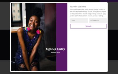
2. Row Layouts
BEFORE

AFTER

3. Tab Layouts
BEFORE

AFTER

4. Combining Two Rows
BEFORE

AFTER

5. Combining Two Sections
BEFORE

AFTER

Transforming Your Mobile Design Experience
Why Use the Divi Mobi Column Classes Plugin?
- Seamless Integration: Say goodbye to complicated coding. Our plugin simplifies the process, making it accessible to designers of all skill levels.
- Design Freedom: With over 30+ layouts at your disposal, the possibilities are endless. Tailor your site to fit your unique brand identity and user needs.
- Improved User Engagement: Mobile users demand fast, easy-to-navigate websites. Our plugin ensures your site meets these expectations, leading to better engagement rates.
Real-World Success Stories
Countless Divi users have witnessed their mobile sites transform from simple to spectacular. Whether it’s a local bakery that saw a 50% increase in online orders or a blogger who doubled their readership thanks to better mobile navigation, the success stories are endless. With the Divi Mobi Column Classes Plugin, these successes are not just possible; they’re within reach.
Conclusion
In today’s mobile-first world, your website’s mobile design is not just a necessity; it’s a critical component of your online success. The Divi Mobi Column Classes Plugin not only makes mobile design accessible but empowers you to create captivating, high-converting mobile websites with ease. From detailed tutorials to a vast library of design options, this plugin is your all-in-one solution to mastering mobile web design with Divi. Join the ranks of successful Divi designers and transform your website today!
To learn more about the divi plugin/theme got to https://www.elegantthemes.com/


0 Comments