A CREATIVE AGENCY
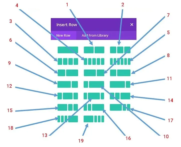
Divi Mobi First Column Classes Plugin
From one column to any column with the new Divi Mobi First Column Classes Plugin. Get full control over the number of columns displayed for the selected row in both the regular and specialty sections.

Our Motivation
Your content goes here. Edit or remove this text inline or in the module Content settings. You can also style every aspect of this content in the module Design settings and even apply custom CSS to this text in the module Advanced settings.
Problem 1
You are an awesome Divi child theme designer. You have built tons of great websites. Your desktop designs look great, but do you get the same reaction from the mobile user? Most Divi designers focus mainly on desktop conversions and ignore mobile impressions. It is not your fault. In fact, if there was a way to have full control over the default ONE column layout on the Divi builder, would you not take advantage of this? Most times we expect our desktop designs to somehow adapt to the mobile viewport, and once there is nothing overlapping, we consider it acceptable. But, this is a huge oversight, especially when appealing to the mobile user experience.
Problem 2
Problem 3
Within the first 10 seconds your potential customer is building up a lasting opinion about you based on your web design. Make sure you make the right first impression on every device.
Sed ut perspiciatis unde omnis iste natus error sit voluptatem accusantium doloremque laudantium, totam rem aperiam.
Company
Careers
About
Blog
Contact
Contact Us
Help/FAQ
Affiliates
Social
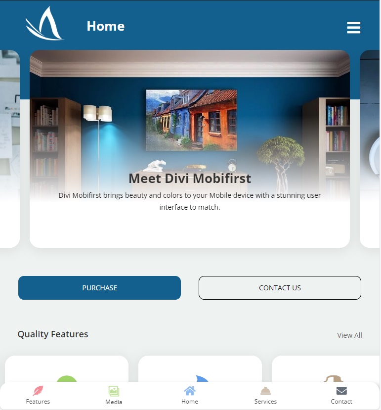
Mobile Adapted Designs
It’s time to shift the way you think about building websites; from Desktop First to Mobile First. That’s right! With just a few clicks you too can now build aesthetically beautiful mobile designs with our light-weight, intelligently crafted plugin for the Divi builder.
Enjoy Limitless Possibilities
Step up your Divi Front End game by moving away from the norm of finding a module for all your designs. Finally you can create any design you want for both the desktop and mobile device. Create beautiful layouts that look absolutely stunning on both your smart device and desktop PC that make users wonder if your site was built with Divi.
Build App-Like Layouts Easily
Imagine, at your fingertips, having the power to create gorgeous high converting mobile websites without having to install additional modules. Create your own layouts in minutes and transform your regular desktop sections into a highly optimized mobile masterpiece.
In Just 3 Easy Steps
Copy the class name for the desired Row
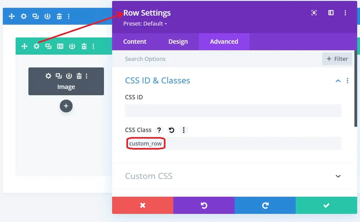
Paste class name in the CSS Class text box under the advanced tab

1
hover
2
hover
3
hover
Also, As A BONUS
Whatapp Support Chat For WordPress

Allow your customers to open a conversation from your website directly to your WhatsApp phone number. This plugin includes a button where you can include a pre-set message, which will be automatically be the first message in the conversation.
PLUS
Get all the layouts you see on this site as pre-done templates so you can reverse engineer and get started quickly.
Get access to membership downloads and additional resources to enhance your building and learning experience.
Lifetime updates and monthly inspired templates.
All these and more when you Purchase Today.
Create Beautiful App-Like Layouts
create any design you want for both the desktop and mobile devices. Create beautiful layouts that look absolutely stunning on both your smart device and desktop PC that make users wonder if your site was built with Divi.
Create Advanced Desktop Layouts Easier
Fuel your imagination by embedding rows and sections side by side. Create gorgeous high converting mobile websites without having to install additional modules. Create your own layouts in minutes and transform your regular desktop sections into a highly optimized mobile masterpiece.
Join Templates Club
Purchase today, become a life-long member and get recurring ideas and layout downloads to reverse engineer and learn CSS and jQuery while you build.